


Portra: The Modern-Day Kodachrome
How Portra got its place as a favorite for analog photographers

I had a conversation the other day with someone about how Portra has become the modern day Kodachrome in terms of popularity between analog photographers, so figured I would expand on it, write an article, and voice my views that nobody asked to hear (read?)...whatever.
There was a time when Kodachrome was the film. It didn’t matter if you were a war correspondent in Saigon, snapping family vacation slides, or Steve McCurry on assignment for National Geographic—it was the holy grail of color film. Known for its punchy reds, rich blues, deep contrast, and insane archival permanence, Kodachrome wasn’t just popular. It was a benchmark. But it came with baggage: complex, proprietary processing (K-14), zero tolerance for exposure screw-ups, and a complete lack of flexibility. It was slide film—you either nailed the shot or you didn’t. There was no saving it in post, no "eh, we’ll fix it in the scan."
And then it died. Kodak killed off Kodachrome officially in 2009, though it had been limping along long before that. Processing labs shuttered one by one, until Dwayne’s Photo in Kansas ran the final roll through the final tank.
So where does that leave us? For the past decade and change, a new king has been quietly taking over. Not because it looks like Kodachrome—it absolutely does not—but because of how people use it, how they trust it, and how it’s become the default stock for color film shooters everywhere: Portra, especially Portra 400.
Let’s get the technicals out of the way first.
Portra 400 is a daylight-balanced color negative film with ISO 400 speed, ultra-fine grain for its class, and one of the widest exposure latitudes of any color film currently produced. You can overexpose it by two stops and it still renders detail without blowing highlights. You can underexpose it a stop and a half, maybe more, and still pull shadows back without turning the whole frame into a soup of mud and sadness. It scans beautifully, which—let’s be honest—is how most people interact with film today, but that’s a discussion for another day. Oh, and it’s flexible. Crazy flexible.
Where Kodachrome would punch you in the face with saturation, Portra kind of leans in and whispers. The colors are smooth, pastel-like. Skintones are flattering without the waxy glow that some digital profiles lean toward. Blues are soft and airy—what people often call “creamy.” Oranges and reds stay neutral and controlled, which makes golden hour and red-brick architecture, or daytime desert scenes, look elegant instead of radioactive. Greens are toned down, desaturated enough to avoid the highly saturated foliage you’d see on something like Velvia, or even Ektar 100. Though I really, really love the greens and reds Ektar produces. Okay, but this is about Portra, so let’s stay focused.
The thing is, Portra doesn’t slap you. It seduces you. It gives you a canvas with tone, not a crayon box explosion. And it’s this restraint that makes it feel timeless. You can shoot a street scene in New York, a desert landscape in Nevada, or a foggy wedding in a forest and Portra will show up for you. It doesn’t scream. It glows.
But no, Portra is not Kodachrome. The chemistry is night and day. Kodachrome was a transparency film—what you shot was what you got. Portra is negative film, meaning you scan and invert it, and can tweak the tone curve to suit the look you're after. Kodachrome had almost no grain (at ISO 25 or 64, of course), extremely high acutance (perceived sharpness), and hard shadows with rich contrast. It aged well. Like… archival well. Portra doesn’t fight to preserve color like Kodachrome did, and the grain is present at higher ISOs—but it’s fine, even silky, thanks to Kodak’s T-Grain emulsion - particularly used in Portra 160 and 400.
So why call Portra the modern-day Kodachrome?
Not because they look the same. They don’t.
But because Portra now holds the cultural and creative position that Kodachrome once did. It’s the go-to stock. The film that both amateurs and professionals reach for when they want reliability without compromise. It’s what wedding photographers use to get soft tones in sun or shade. It’s what street photographers use for natural colors in unpredictable lighting. It’s the stock you trust with a once-in-a-lifetime trip because you know it won’t betray you. A fun story about this a bit later.
But that’s why it’s everywhere. You see it in photo zines, on Instagram, in galleries, in YouTube thumbnails. It’s baked into the visual language of the modern analog revival.
So yeah—Kodachrome may have been the film of the 20th century, but in the weird, digital-analog hybrid world we’re in now, Portra 400 wears the crown. It didn't steal it. It earned it. Quietly, patiently, roll by roll.
And it’s still in production.
For now.
So which Portra film stock should you choose, and why? Well, the answer is simply all of them, but below I’ve included some details about each one to help you make your decision.
Portra 160
Portra 160 is the cleanest and calmest of the Portra lineup. With its ultra-fine grain and lower contrast, it’s ideal for well-lit scenes where you want smooth tones and maximum control—especially for portraits. Skin tones come out buttery and balanced without ever skewing pink or green, and the lower saturation gives everything a subtle, refined look that feels more painterly than punchy. Blues and greens stay soft and creamy, with highlights that hold up beautifully when exposed properly. It’s not built for chaos or unpredictable lighting—but if you give it light, it rewards you with elegance. I love Portra 160 for late dusk images, especially where the sky has smooth gradation between deep blue and pinks and purples. I feel that Portra 160 really shines for these images. You can especially see a lot of that in Alex Burke’s photography, as Portra 160 is a film stock he makes use of quite often for his images.
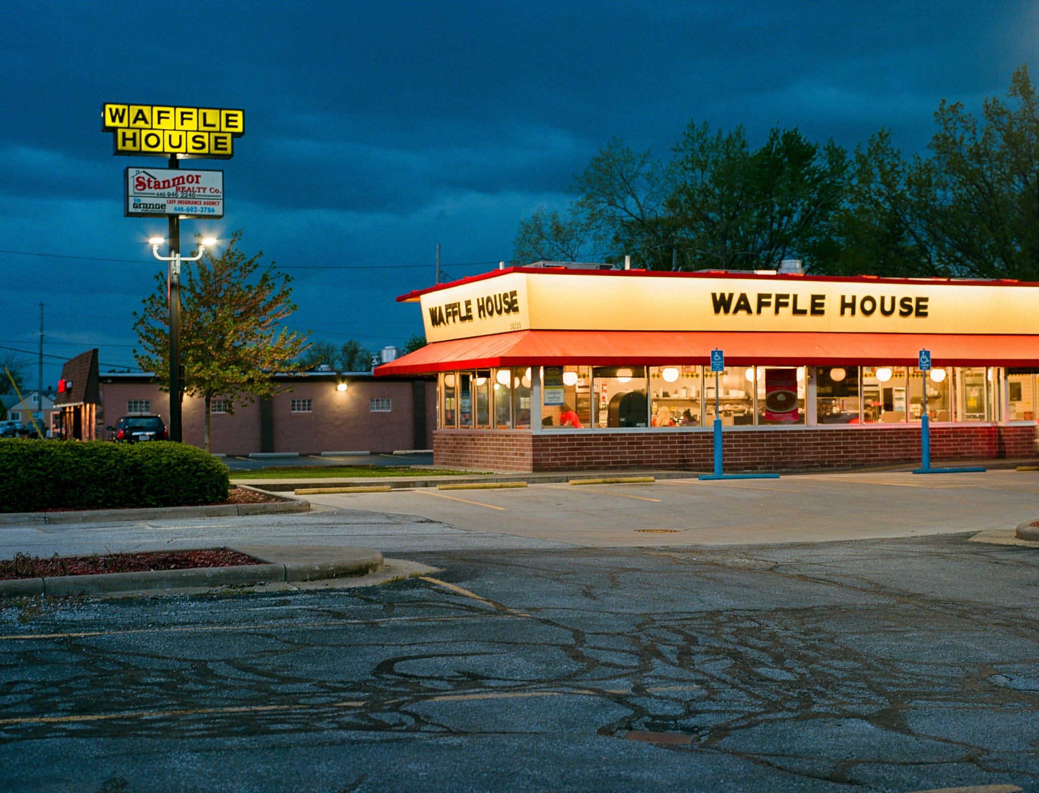
Photo of a Waffle House in Willoughby, Ohio taken on Portra 160
Portra 400
This is the all-around champ—Portra 400 is the stock most film shooters swear by, and for good reason. It’s fast enough for unpredictable lighting, forgiving enough to overexpose by two stops (or more) without nuking your highlights, and flexible enough to underexpose without wrecking your shadows. The colors are rich without being loud—reds and oranges hold a beautiful neutrality that makes golden hour glow without going overboard, greens lean toward desaturated sage rather than neon lawn, and skies take on that soft, creamy blue that’s practically a signature at this point. It scans like a dream, and whether you're shooting weddings, street, travel, or portraits, Portra 400 just works.
Speaking of overexposure with Portra 400, I have personally experienced just how far you can truly push the film before it becomes unusable, and I can fairly confidently say, you will probably never run into that issue. Well, unless you REALLY mess up. Hey, it can happen when you’re first learning what all of these numbers mean, and are still getting used to how to meter your exposures. It is what it is. Still, it probably won’t happen.
When I traveled out west in 2022, I brought a Mamiya 645 Pro that I had just picked up before the trip. Unfortunately, I would later learn that not only was the mirror stop busted, so focus was all out of order, but in addition, my aperture was stuck open on my lens at 2.8 the entire time. I hadn’t tested this, so I hadn’t noticed. This is mostly my fault for not paying any attention, nor running a test roll before using it on this trip. It is what it is though, and I still ended up with many usable images from the trip, thanks to the incredible latitude Portra 400 offers.
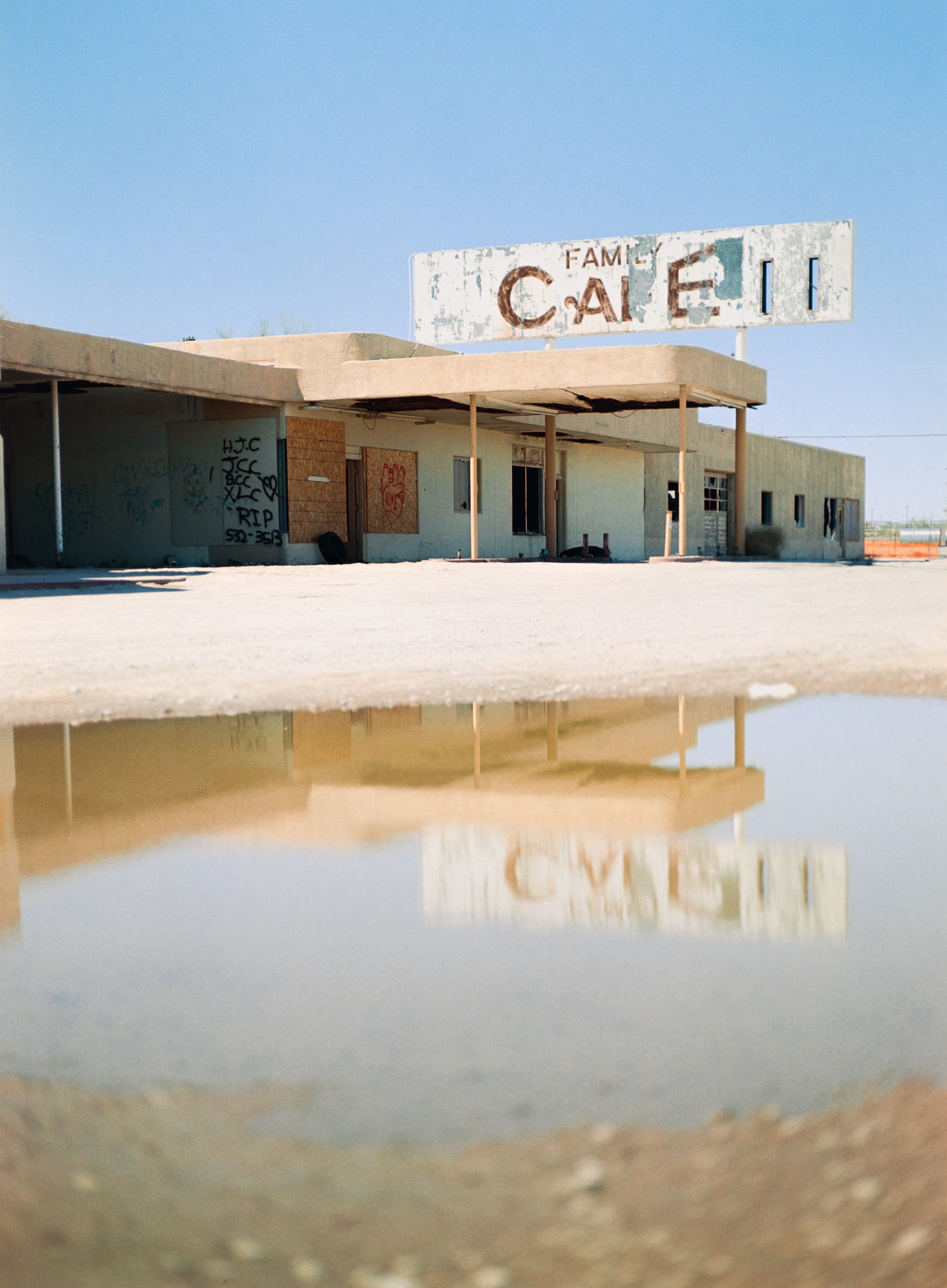
^^ That’s an image that was overexposed by about 4 or 5 stops (I can’t remember exactly) on Portra 400 - taken in Desert Center, California during my trip out west in 2022
I was using external metering, so when shooting at f8, or f11 (as I thought I was), I was exposing for this smaller aperture. Additionally, I was already exposing the film at 200, rather than 400, because this film loves light, and a bit of overexposure gives a wonderful creamy, more pastel look to the colors, which I enjoy. You could see where this would lead some images to being overexposed by 4 or more stops. However, even with all of that overexposure, I still ended up with usable images, further cementing that Portra has quite an incredible exposure latitude, and though kind of pricey currently, is perfect for beginners and professionals alike.
As for the broken bits on my Mamiya, thankfully, I was able to send the camera and lens off to Bill Rogers at mamiyarepair.com
Bill is an incredible, friendly and very helpful person, and did a fantastic job fixing my Mamiya to get it back to working order.
It’s great that Bill is offering a resource for these cameras, and it’s nice to be able to send it off to someone who is incredibly knowledgeable about them. So HUGE thanks to Bill for getting my Mamiya back to perfect working order.
And finally, Portra 800
Portra 800 doesn’t get nearly enough love, and that’s a shame, because it absolutely kills it in low light. It has all the color fidelity you expect from the Portra line, but with a bit more bite—slightly more contrast, more visible grain (still fine for the speed), and a moodier edge that looks great under tungsten or streetlights. Reds and yellows feel a bit more alive here, making it a solid choice for warm, late-evening light or cozy interiors. It’s also excellent for shooting handheld at dusk without pushing in development. And while you’ll notice more grain compared to 400, it’s tight and organic—not a dealbreaker by any stretch, and definitely offers a certain “look.” For night shooters, indoor work, or people chasing a moodier aesthetic, Portra 800 quietly delivers.
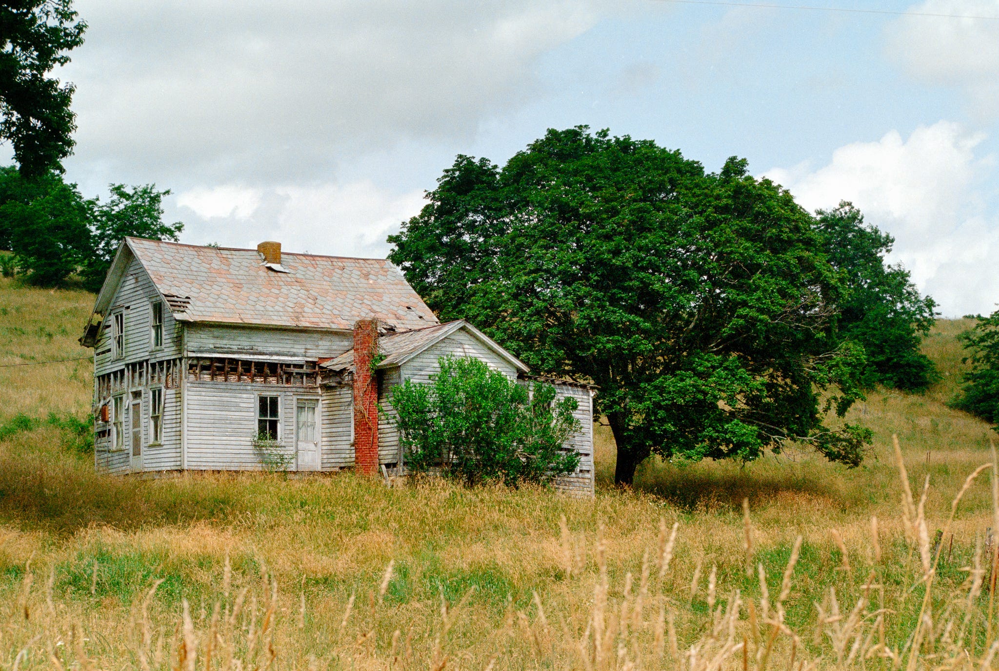
An abandoned home in rural Ohio, shot on Portra 800
Anyway, there it is. Portra is the modern day Kodachrome and you can’t change my mind.
If you shoot film, and have shot with any of the Portra stocks, which have you found to be your personal favorite?
Below are some images I’ve taken using Portra 800, 400 and 160 film.


